ko hi suki is a contemporary Japanese luxury coffee house shaped around the art of stillness.


ko hi suki is a Japanese-inspired luxury coffee house, designed with the sole purpose of
providing you with a space for still moments away from the noise of the fast-moving world.
ko hi suki is a Japanese-inspired luxury coffee house, designed with the sole purpose of providing you with a space for still moments away from the noise of the fast-moving world.

ko hi suki
ko hi suki
Design Philosophy
Design Philosophy
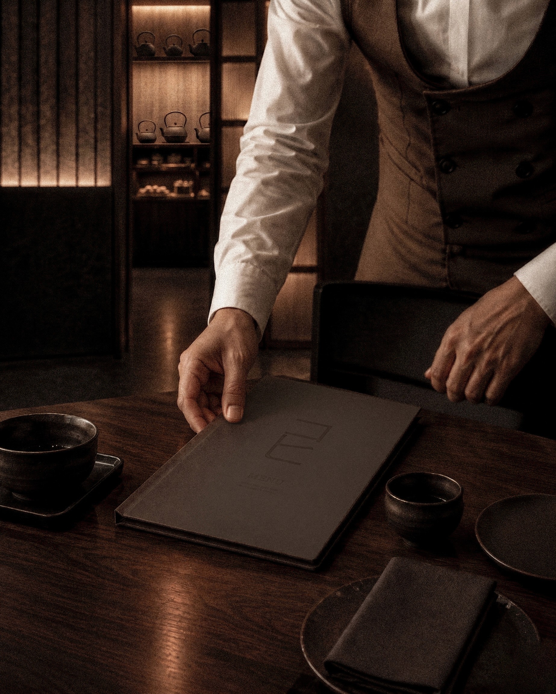
A place where you can pause and have a deeper conversation, discovering more about yourself or your loved ones through
the calming ritual of having a coffee and tea.
A place where you can pause and have a deeper conversation, discovering more about yourself or your loved ones through
the calming ritual of having a coffee and tea.
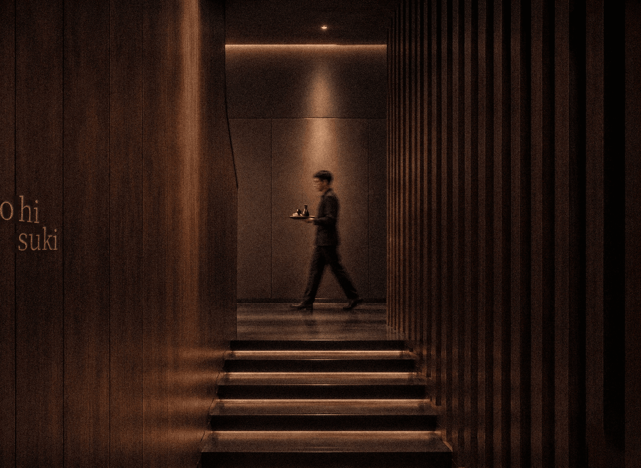
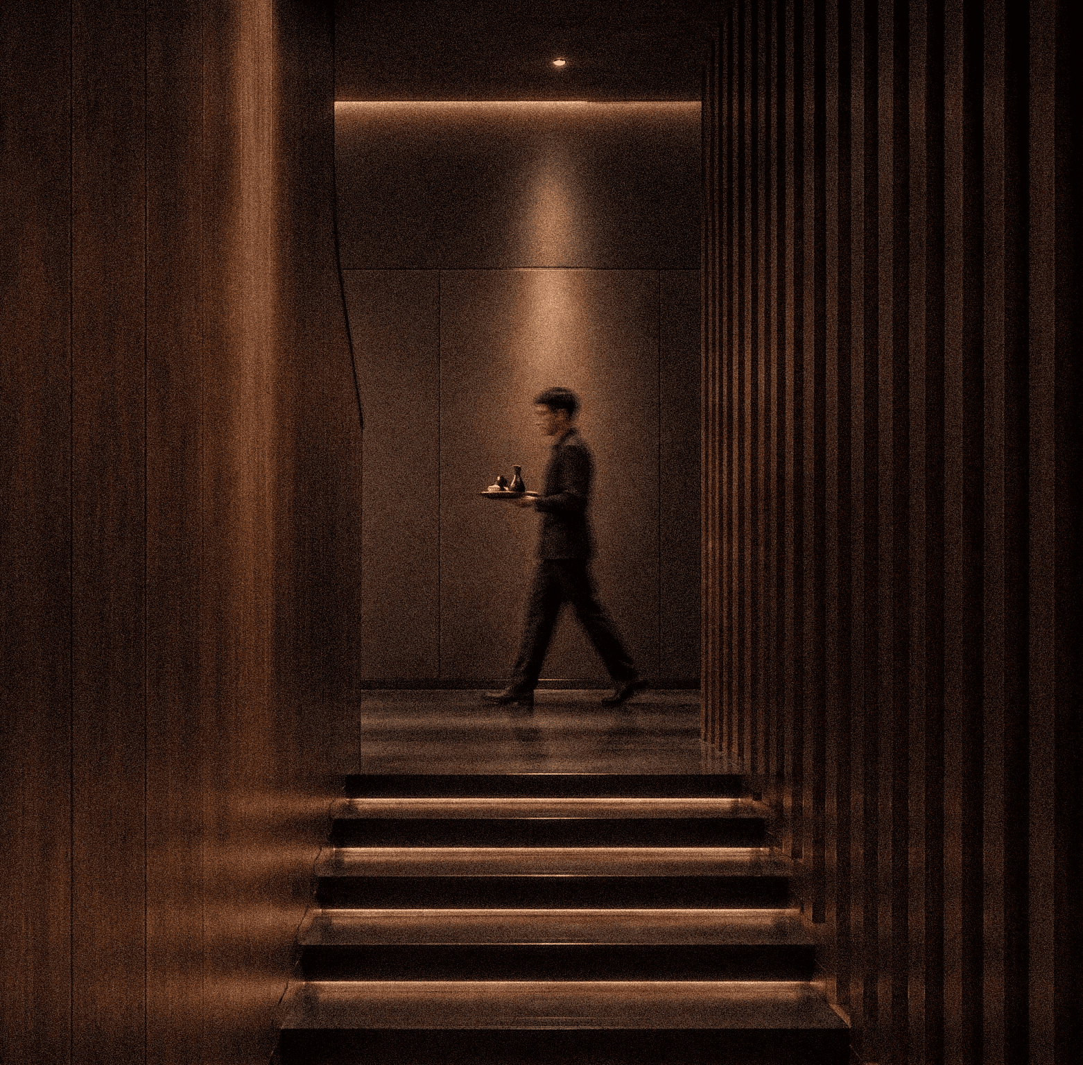
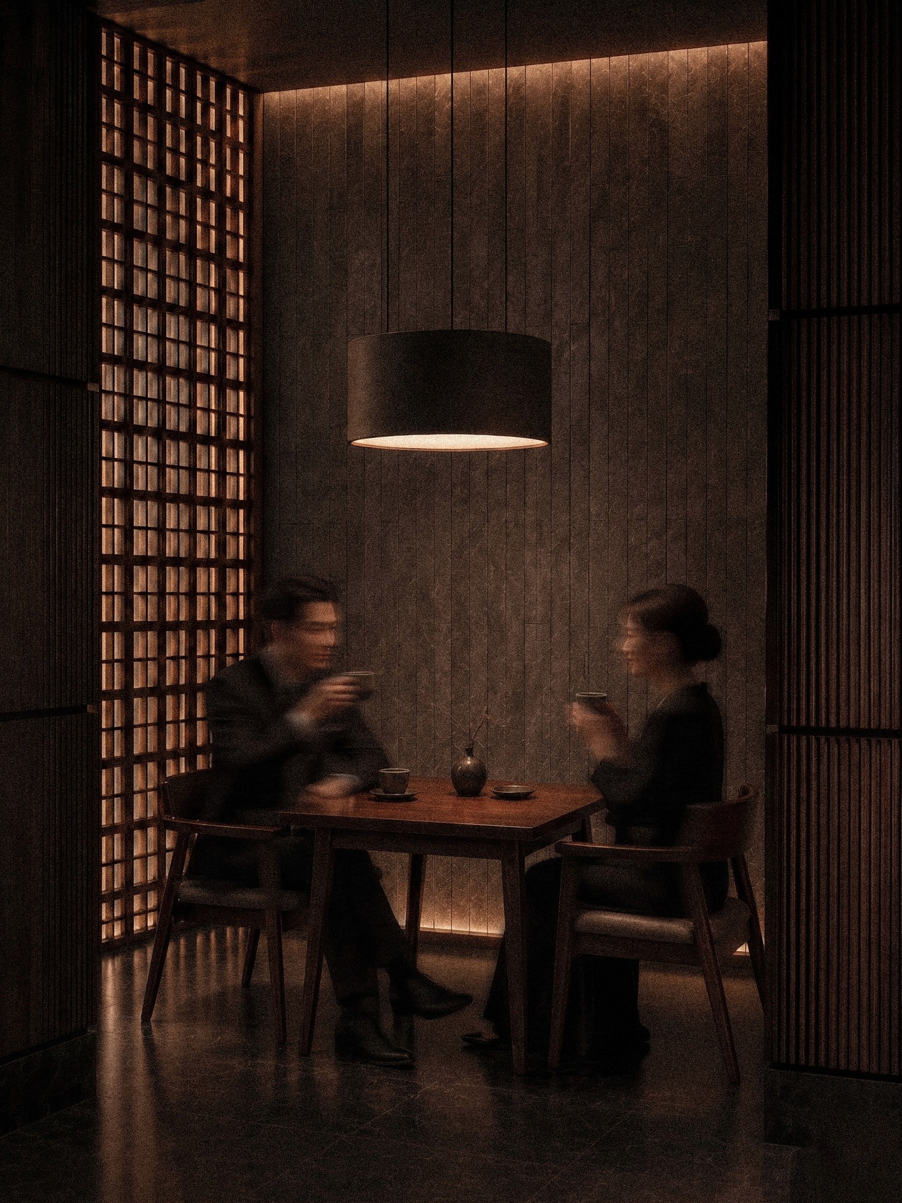
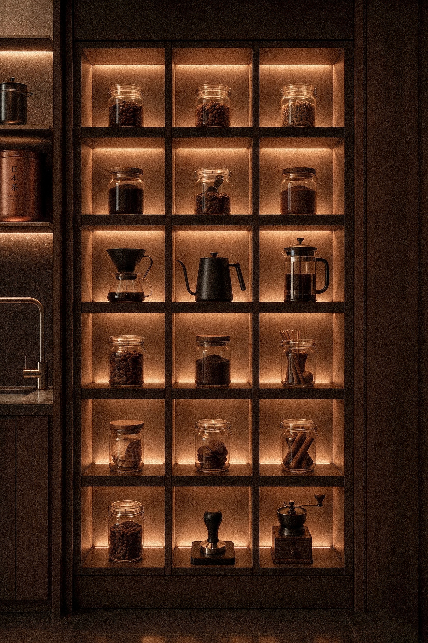
Based on Japan's rich coffee and tea culture, blended with a contemporary edge, the space is designed with dark, muted lighting and a minimalist aesthetic, to not create a sense of chaos or loudness, instead it is intended to evoke a feeling of calmness inside you, allowing you the time to relax and reflect upon things you cannot otherwise dwell upon in everyday life.
Based on Japan's rich coffee and tea culture, blended with a contemporary edge, the space is designed with dark, muted lighting and a minimalist aesthetic, to not create a sense of chaos or loudness, instead it is intended to evoke a feeling of calmness inside you, allowing you the time to relax and reflect upon things you cannot otherwise dwell upon in everyday life.


A Refined Visual Language
A Refined Visual Language
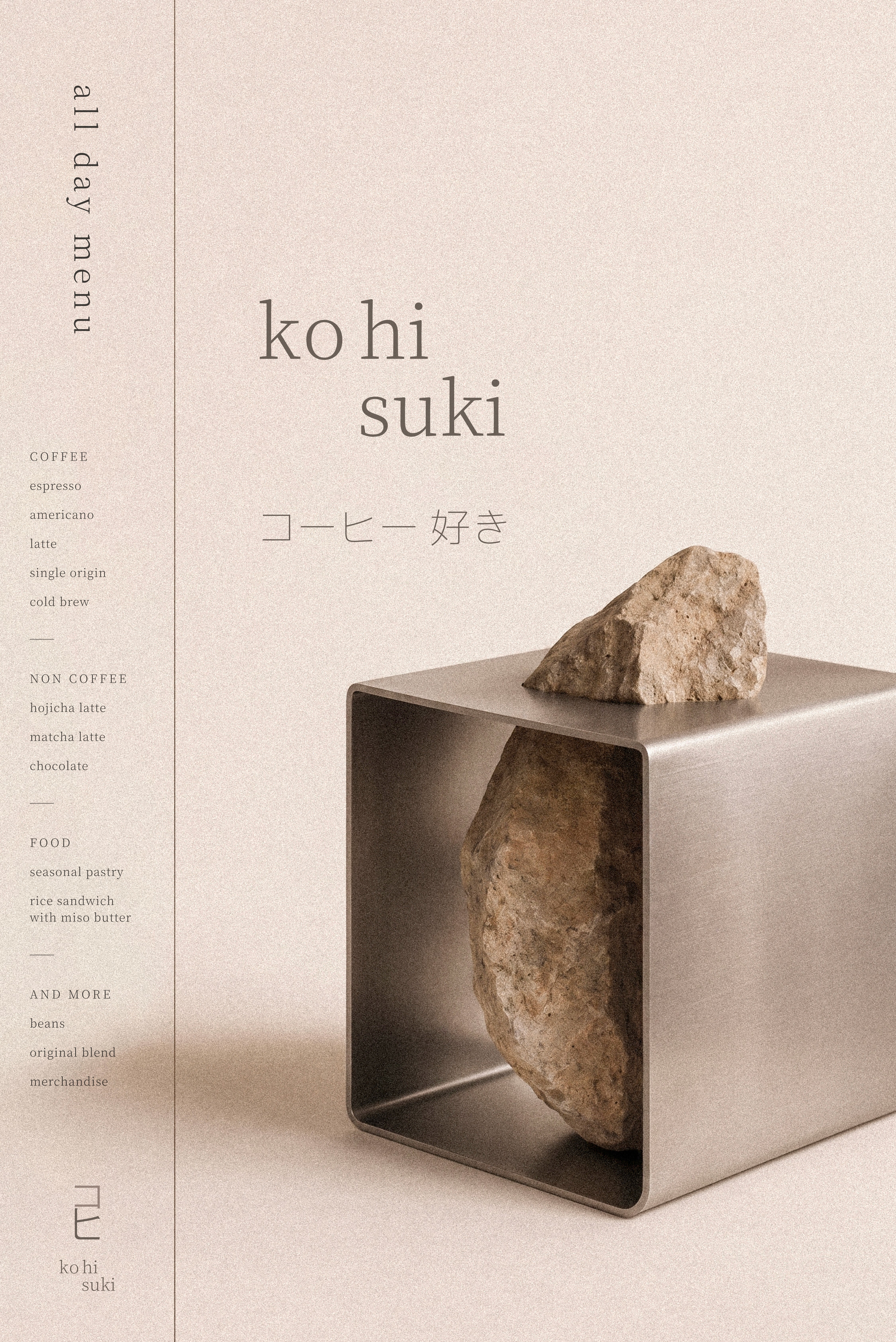
Supported by two typefaces, the primary serif typeface captures the intricate details found in these native scripts, bringing a sense of cultural depth and expressing the elegance of the brand. The supporting sans-serif typeface offers a clean contrast to the serif, reflecting the simplicity found in Japanese design, while ensuring readability and maintaining the sophisticated tone.
Supported by two typefaces, the primary serif typeface captures the intricate details found in these native scripts, bringing a sense of cultural depth and expressing the elegance of the brand. The supporting sans-serif typeface offers a clean contrast to the serif, reflecting the simplicity found in Japanese design, while ensuring readability and maintaining the sophisticated tone.
Supported by two typefaces, the primary serif typeface captures the intricate details found
in these native scripts, bringing a sense of cultural depth and expressing the elegance
of the brand. The supporting sans-serif typeface offers a clean contrast to the serif, reflecting the simplicity found in Japanese design, while ensuring readability and maintaining the sophisticated tone.
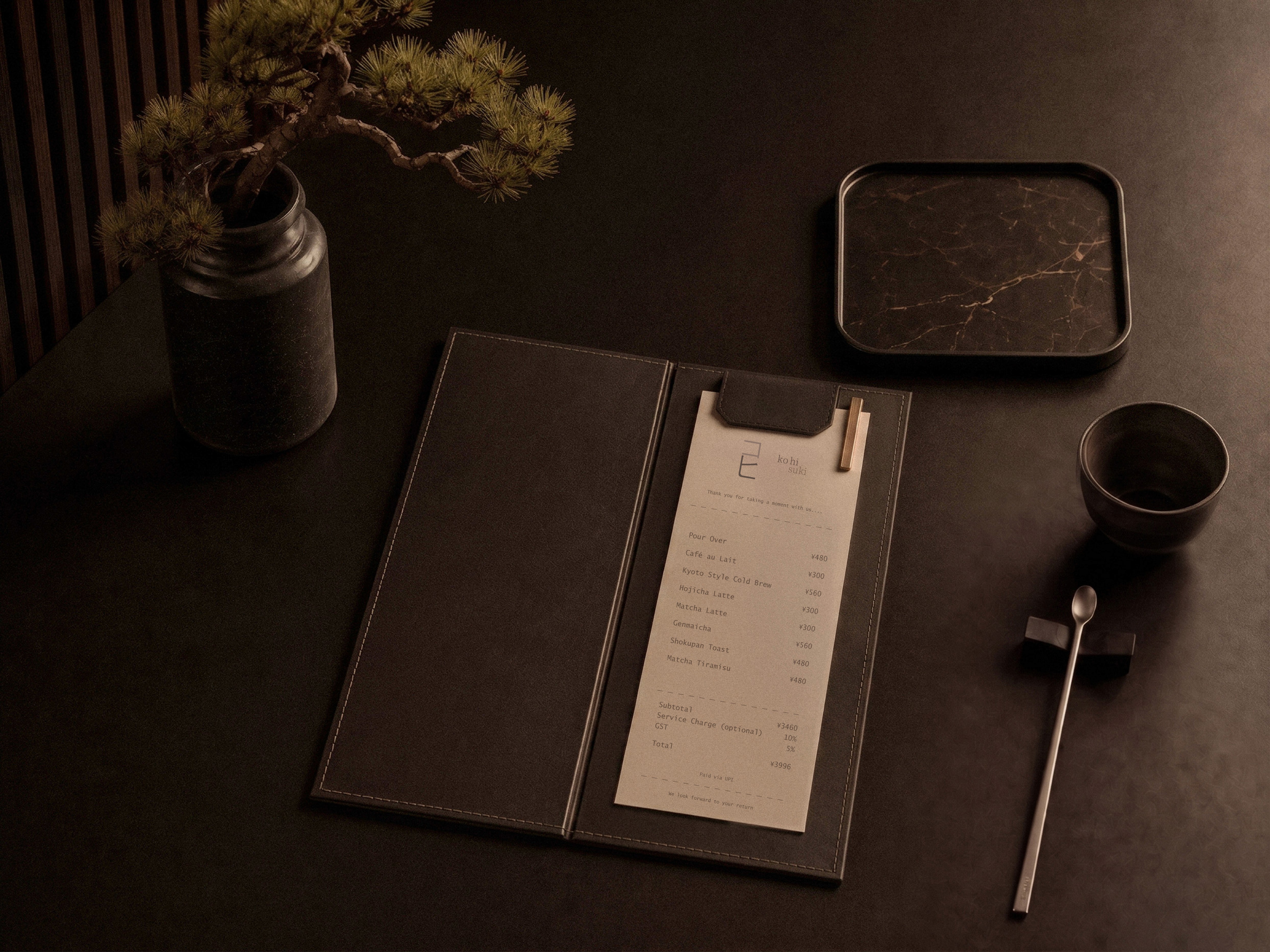
The palette forms up of four colors- Beige, Coffee Brown, Muted Taupe,
and Ruby Red, chosen to evoke a sense of calmness and lightness. While
still dawning the grounding tones and rich aroma of coffee, the palette
brings out warmth and reflects the emotional and sensory experience
of the space, elevated through luxury.
The palette forms up of four colors- Beige, Coffee Brown, Muted Taupe, and Ruby Red, chosen to evoke a sense of calmness and lightness. While still dawning the grounding tones and rich aroma of coffee, the palette brings out warmth and reflects the emotional and sensory experience of the space, elevated through luxury.


Explore more works
Explore more works