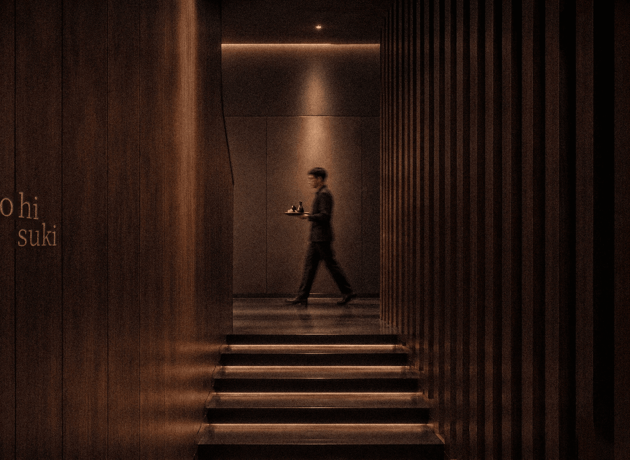
ko hi suki is a contemporary Japanese luxury coffee house shaped around the art of stillness.


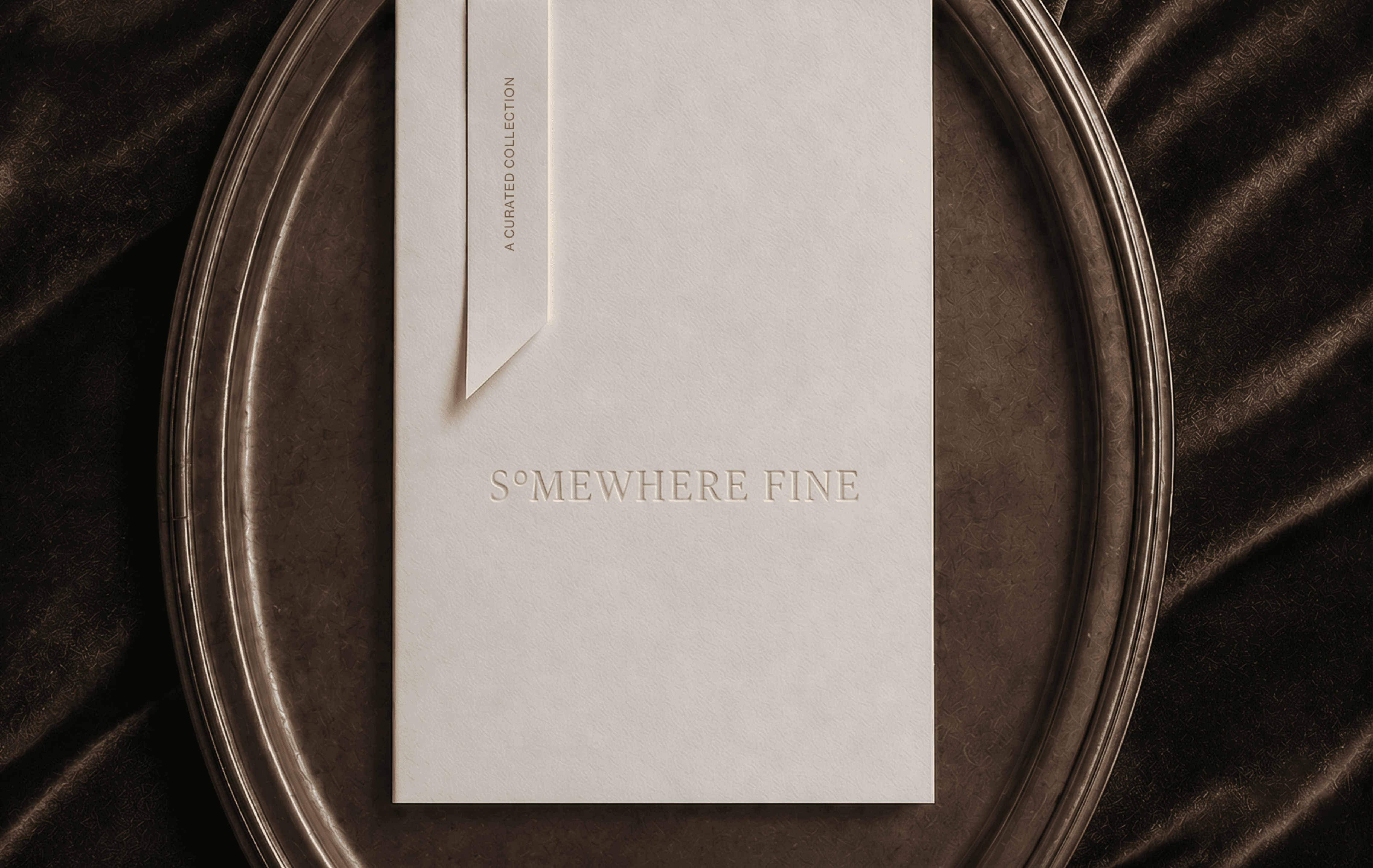
Somewhere Fine
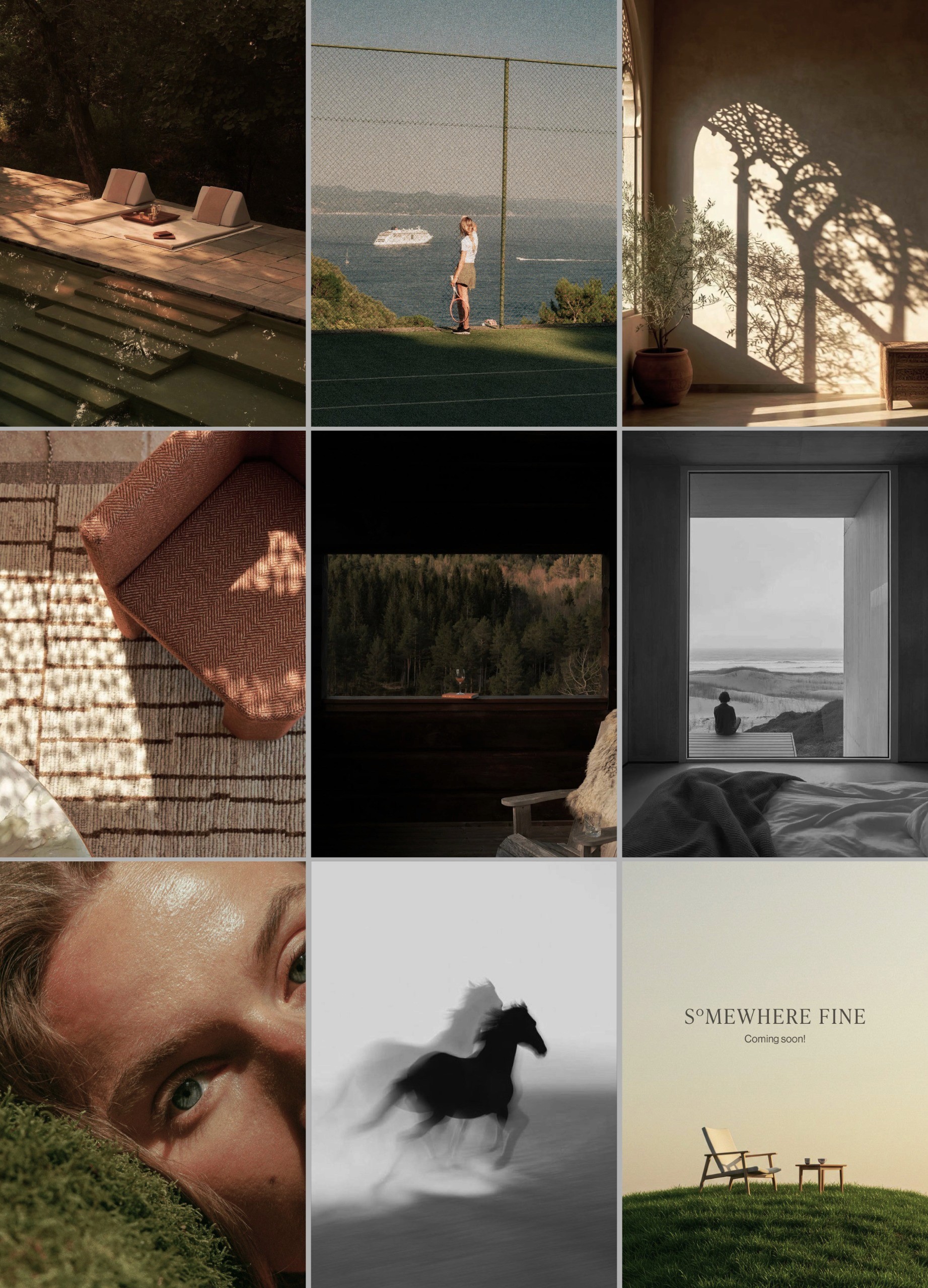
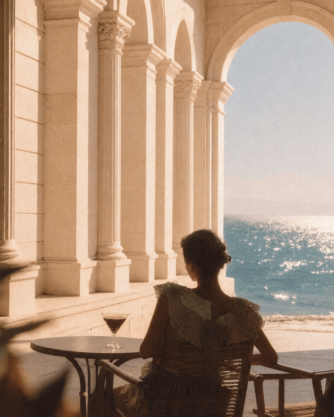
The Somewhere Fine website is designed as a considered introduction to a curated collection of exceptional stays. Built with a minimal and editorial approach, the platform prioritises clarity, ease of discovery, and visual storytelling.
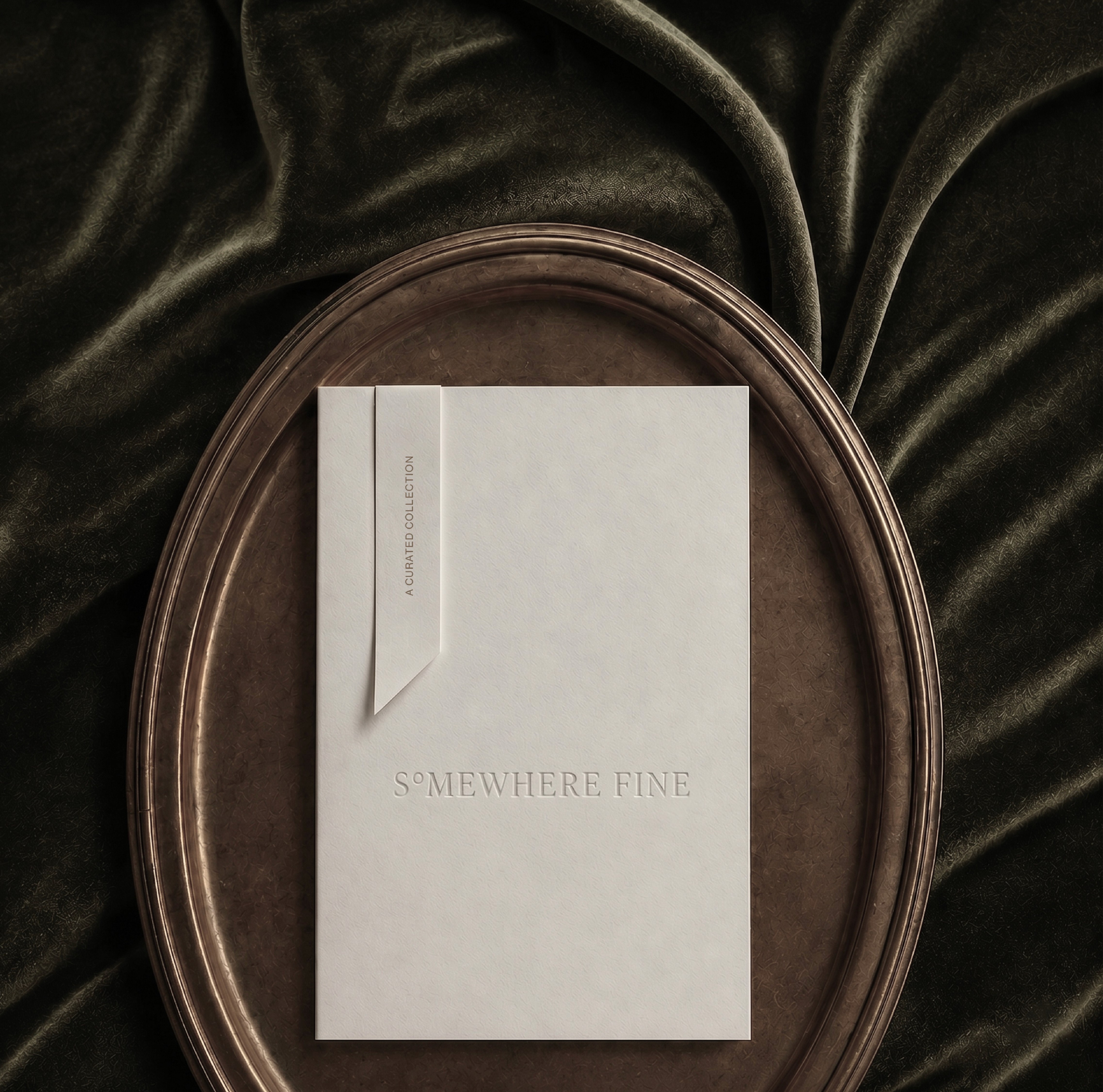
The Somewhere Fine website is designed as a considered introduction to a curated collection of exceptional stays. Built with a minimal and editorial approach, the platform prioritises clarity, ease of discovery, and visual storytelling.
Somewhere Fine

Design Philosophy
The design of Somewhere Fine is rooted in the belief that where we stay shapes how we experience a place.
Inspired by editorial publishing, timeless
hospitality, and considered travel, the visual
language is calm, refined, and purposeful.
The design of Somewhere Fine is rooted in the belief that where we stay shapes how we experience a place.
Inspired by editorial publishing, timeless
hospitality, and considered travel, the visual
language is calm, refined, and purposeful.
The design of Somewhere Fine is rooted in the belief that where we stay shapes how we experience a place.
Inspired by editorial publishing, timeless
hospitality, and considered travel, the visual
language is calm, refined, and purposeful.
Typography, spacing, colour, and imagery are used to create atmosphere rather than demand attention.
The goal is not to express luxury through excess,
but through simplicity, and attention to detail.
By removing the unnecessary, the design allows the places, experiences, and stories to take centre stage.
Typography, spacing, colour, and imagery are used to create atmosphere rather than demand attention.
The goal is not to express luxury through excess,
but through simplicity, and attention to detail. By
removing the unnecessary, the design allows the
places, experiences, and stories to take centre stage.
Typography, spacing, colour, and imagery are used to create atmosphere rather than demand attention.
The goal is not to express luxury through excess,
but through simplicity, and attention to detail.
By removing the unnecessary, the design allows the places, experiences, and stories to take centre stage.

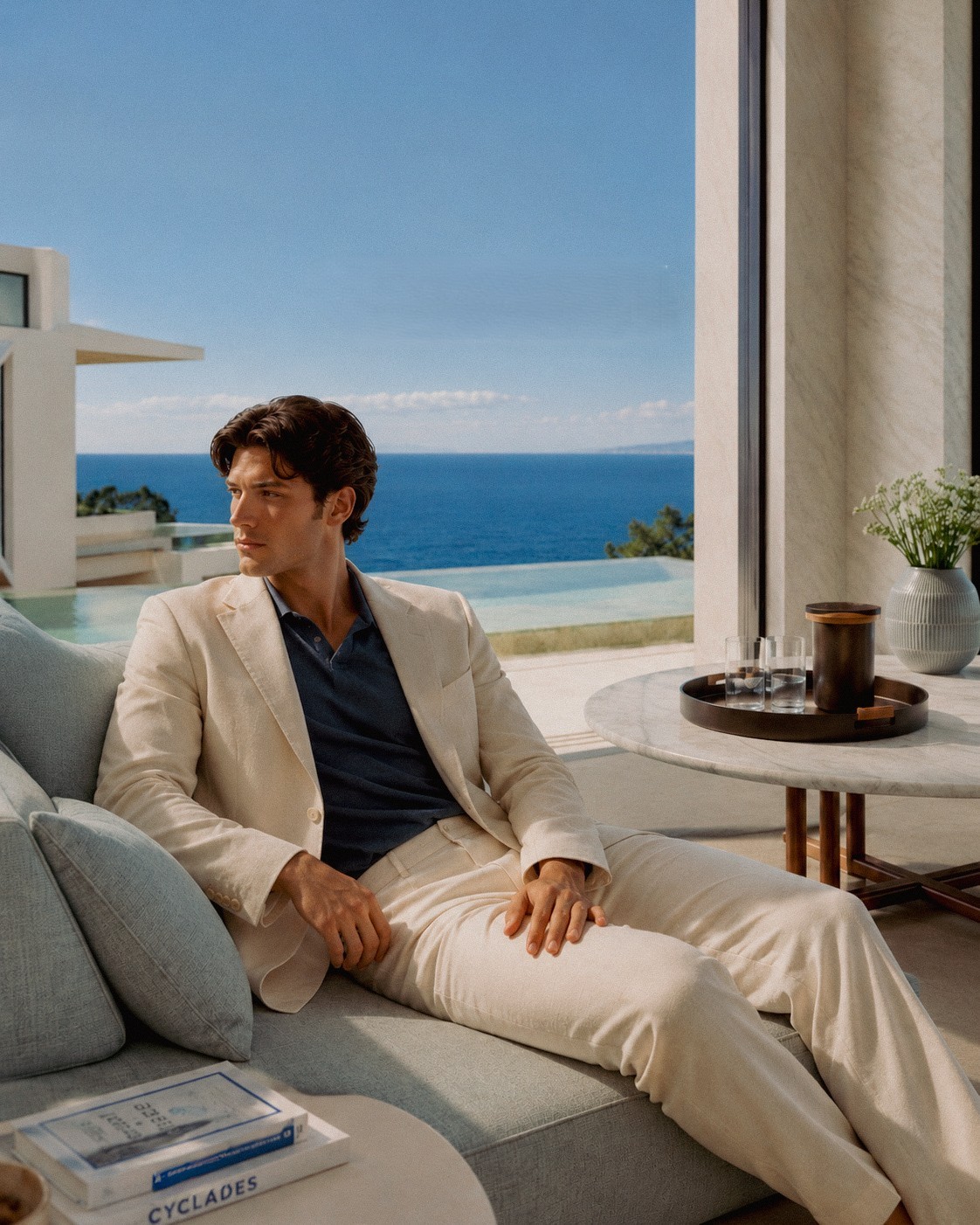
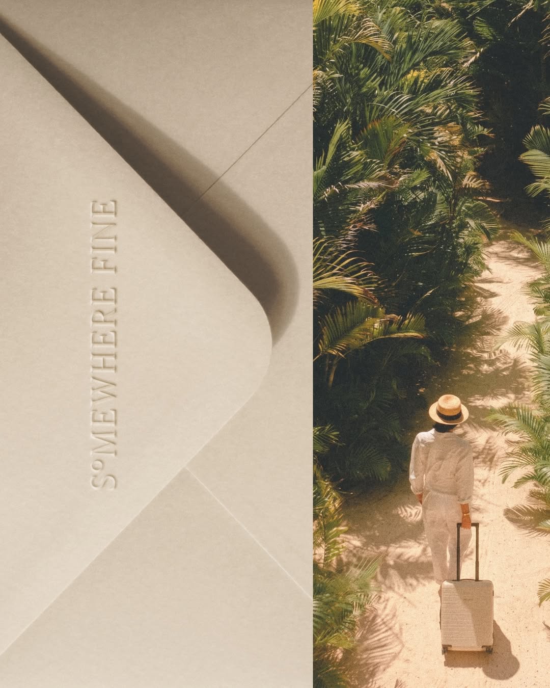
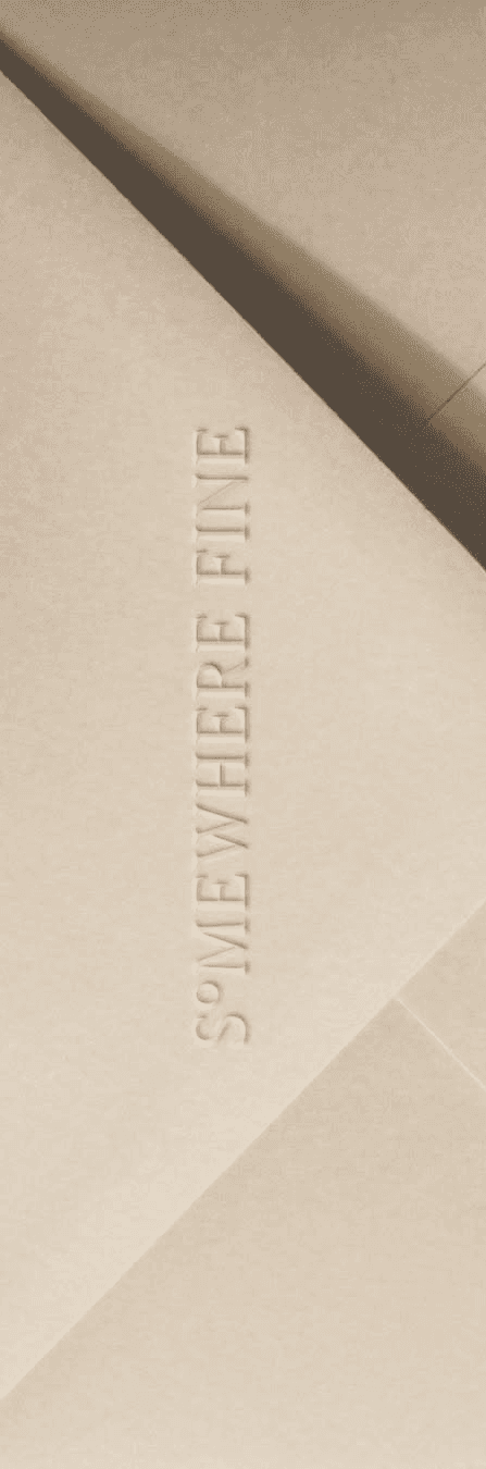
Somewhere Fine was designed around a feeling rather than a category. The intention was to create a brand that feels thoughtful, confident, and timeless without relying on the visual cues often associated with luxury.
The identity balances simplicity with character, drawing influence from
travel journals, editorial publications, and the quiet details that define
a memorable stay. Every design decision, from typography and layout
to imagery and interaction, is guided by the idea of slowing the
experience down and allowing users to focus on what matters.
Somewhere Fine was designed around a feeling rather than a category. The intention was to create a brand that feels thoughtful, confident, and timeless without relying on the visual cues often associated with luxury.
The identity balances simplicity with character, drawing influence from travel journals, editorial publications, and the quiet details that define a memorable stay.
Every design decision, from typography and layout to imagery and interaction, is guided by the idea of slowing the experience down and allowing users to focus on what matters.
Somewhere Fine was designed around a feeling rather than a category. The intention was to create a brand that feels thoughtful, confident, and timeless without relying on the visual cues often associated with luxury.
The identity balances simplicity with character, drawing influence from travel journals, editorial publications, and
the quiet details that define a memorable stay. Every design decision, from typography and layout to imagery and interaction, is guided by the idea of slowing the experience down and allowing users to focus on what matters.
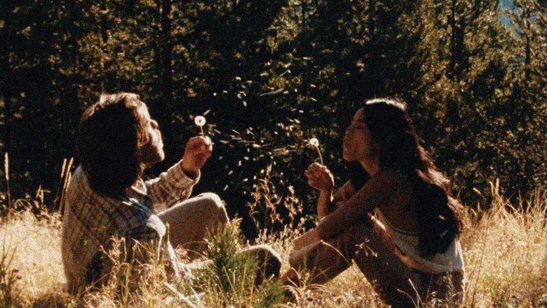
Rather than creating a loud visual identity, the focus was on building a sense of atmosphere through thoughtful composition, typography, and imagery. The result is a brand that feels timeless, understated, and deeply connected to the experience of travel.
Rather than creating a loud visual identity, the focus was on building
a sense of atmosphere through thoughtful composition, typography, and imagery. The result is
a brand that
feels timeless, understated, and deeply connected to the experience of travel.
Rather than creating a loud visual identity, the focus was on building
a sense of atmosphere through thoughtful composition, typography, and imagery. The result is a brand that feels timeless, understated, and deeply connected to the experience of travel.
Explore more works